The
Ampersand
HUMANIS BLOG
The Acclaimed Ampersand
Bringing people together in a more personal, authentic way than an ‘and’ could ever do. Our monthly blog post, The Ampersand, and our Podcast, The Ampersand – Unplugged, provide insights into the workplace, the human condition, and the humanity around us.
April 9, 2024
Strategic Solutions: Leveraging Fractional CFOs Amidst CFO Turnover Trends
READ MORE
April 1, 2024
Virtue Signalling – The Ampersand April 2024
READ MORE
March 4, 2024
Look at all the Adulting! – The Ampersand March 2024
READ MORE
February 1, 2024
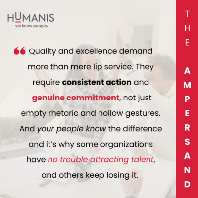
Human Is as Human Does – The Ampersand February 2024
READ MORE
December 1, 2023
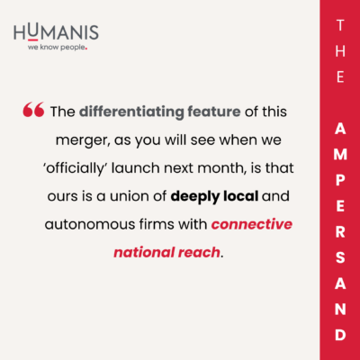
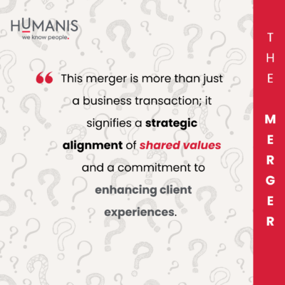
Humanis Talent Acquisition & Advisory Merger – Frequently Asked Questions
READ MORE
December 1, 2023
Landing the Plane – The Ampersand December 2023
READ MORE
November 1, 2023
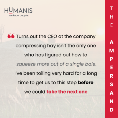
Making Hay – The Ampersand November 2023
READ MORE
October 2, 2023
House Hunters – The Ampersand October 2023
READ MORE
September 1, 2023
Go Home or Go Big – The Ampersand September 2023
READ MORE
May 26, 2023
When A Search Isn’t A Search – The Ampersand June 2023 (Election Edition)
READ MORE
May 1, 2023
The Space-Time Continuum – The Ampersand May 2023
READ MORE
April 1, 2023
The Calm After the Storm – The Ampersand April 2023
READ MORE
March 1, 2023
Human Intelligence – The Ampersand March 2023
READ MORE
February 1, 2023
My Scottish High Lands – The Ampersand February 2023
READ MORE
December 1, 2022
Is Working from Home Working at All? – The Ampersand December 2022
READ MORE
November 1, 2022
Doing Time – The Ampersand November 2022
READ MORE
September 1, 2022
The Imminent Need Business – The Ampersand September 2022
READ MORE
June 1, 2022
The Struggle is Real – The Ampersand June 2022
READ MORE
May 2, 2022
Your Best Offence is a Good Defence – The Ampersand May 2022
READ MORE
March 1, 2022
Having Your Brussels Sprouts, and Eating Them Too – The Ampersand March 2022
READ MORE